Gone are the days when websites used to serve as merely information portals for businesses. Today websites are complex organisms where many different parts are working together to create a meaningful experience for visitors. From a business’ perspective, online forms are the most important part of their website, as they are the conduit between the visitor and the company and they help generate leads — which is the biggest marketing challenge for any business.
For these reasons, online forms are more popular than ever. You will find them on almost every single website. However, forms continue to underperform and the conversion rate is very low. According to one study, contact forms only convert at 3%.
This could be due to a wide variety of causes. For many businesses, form optimization and conversion optimization takes the back seat to the usual marketing campaigns: SEO, brand awareness, social media, content marketing, email marketing, and so on. Some businesses think that forms are passive in nature: people will fill them if they want to fill them. This is a dangerous mentality, as it shifts the responsibility for persuading visitors from your marketing department onto the shoulders of your customers.
A well-designed form will be enticing, frictionless, and valuable for your ideal customer persona. Businesses can use form abandonment software such as Insiteful to recover leads who haven’t completed their forms with automatic follow-up and saved progress.
Insiteful is the easiest way to instantly boost conversions from your existing web forms. Generate more leads, increase marketing ROI, and grow your business faster. Learn more →
Businesses that rely on websites as their primary source of new leads can immensely benefit from optimizing their forms to convert more leads. With that in mind, let us discuss some steps your business can take to make your form better!
1. General best practices
- Keep it simple. Only ask for information that you really need.
- Order form fields in a logical way and by their importance.
- Make clear what you expect by showing examples in field placeholders, labels & help text
- Highlight the current field that is being typed into.
- Users should be able to toggle through the form using their keyboard.
- Provide well-chosen defaults.
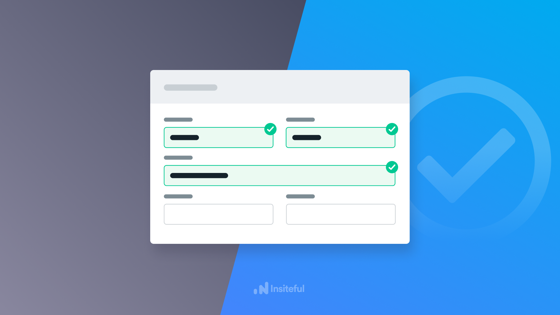
- Give users direct feedback with specific, on-the-fly error messages so they can make necessary changes.
- Spacing between fields, labels & messages should not confuse correlations.
- Save partial entry data in case the user has to go back to make corrections.
- To avoid frustration, indicate mandatory fields.
- Color combinations can be used to indicate the user progress.
- Provide clear feedback both during & after the user has submitted the form.
2. Be careful with form fields
When creating a form, remember its purpose. A form can be used for newsletter signups, sales contact, event registrations, customer feedback, online order and payments, account signups, website visitor feedback, contest registrations, or donations. Each one of these scenarios calls for different types of form fields.
For instance, a person signing up for a newsletter might be fine with giving their email, but not their phone number. Likewise, if they are completing an order and payment form, they would have no problem giving their phone number and address.
3. Use clear copy in your forms
The copy of your website in general and particularly the form(s) is very important in conveying your message and convincing the visitor to complete the form. The form heading will tell the visitor why they are completing the form. If it’s a newsletter sign up form, a couple of lines regarding the value the newsletter will provide would be ideal. While some people will sign up even if your website just says, “sign up for the newsletter”, more would be more inclined to fill the form if you provide the value proposition.
Neil Strauss’ website (pictured below) is a perfect example of using clear and to-the-point copy to communicate why a visitor should sign up and take the time to fill in their details:

Similarly, a donation form can highlight how the donation will be used and the wonderful impact it will have on other people. According to The Daily Egg, the most persuasive words in the English language include: you, easy, guarantee, save, new, proven, results, and free, which can help skyrocket form conversions if used right.
4. User interface design
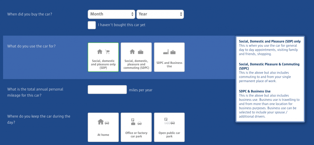
A professional, beautiful-looking form that compliments the design of the rest of the website is essential to create a high-converting form. Although you can get away with a basic form with a couple of necessary fields, high-converting forms generally incorporate forms as a cohesive unit that fits snugly into the overall website experience. The example below from Compare the Market showcases how to pair an innovative UI design (far from the traditional, boring web form) with detailed contextual tooltips and help text to assist users as they fill out the form:
Additionally, keep in mind that any form you choose should stand out in some way, so consider pairing or opposing colors, such as white versus black, etc.
5. Security
According to studies, increasing your security and adding trust signals can boost conversions by as much as 60% or more.
Giving away personal information is a sensitive matter and it would help the visitors if you can instill trust in them regarding their data. Information and transparency is the key to a perfect user experience. Thus, it is crucial that you educate your visitors about anything they may need to know when filling out your web form. This can include why they are filling the form and what happens to their data. Highlighting these important concerns is reassuring for your visitors and keeps them from getting frustrated. You can start by adding a privacy policy link at the end of the form.
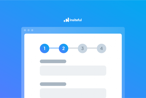
6. Multi-page forms
The general rule of thumb is the fewer fields there are, the better, but sometimes a business requires a higher number of fields because then you have more information and a higher chance of converting. In such a case, it’s better to use a multipage form instead of a single one. Multi-step forms are great for engaging customers because they break down the form into smaller portions, which reduces the likelihood of visitors being overwhelmed by your questions.
Multi-page forms can also be dynamic and the fields on the next page can change according to the answers on the first page. Using a conversational form to capture information has the potential to triple conversions, as demonstrated by Typeform.
 7. Offer assistance
Even just a little resistance in the form can lead your visitor to abandon the form. If any field requires any explanation, you should prominently include that; especially for form fields that are not very common or self-explanatory, some additional context can be helpful. Visitors may not be accustomed to filling out web forms, or they might not understand your question. In a subtle and unobtrusive manner, help text can offer additional information. It is important not to distract, but to offer assistance if necessary.
8. Mobile optimization
Mobile accounts for approximately half of the web traffic worldwide. In the first quarter of 2021, mobile devices (excluding tablets) generated 54.8% of global website traffic, consistently hovering around the 50 per cent mark since the beginning of 2017. It’s very essential to optimize your forms for mobile users. This includes reducing typing, focusing on key content above-the-fold and switching to dropdowns, etc.
9. Lead recovery software
The world is a distracting place: even if you have the most perfect form in the world, it’s still possible for people to get distracted and not complete it. Thus, it is vital to have a “failsafe” backup plan to recover abandoned forms. With Insiteful, you’ll never miss another opportunity thanks to our all-in-one form abandonment software. Capture and convert 100% of prospects that fill out your forms with our intuitive form tracking and automated optimization tools.
From smart insights & form funnel analytics to partial entry tracking, auto email follow-up & saved progress, Insiteful has everything you need to capture & convert more leads from your existing efforts. Try it today — it takes just a few clicks!