Do you know what the difference is between the world’s biggest and most profitable companies and those that operate in the same industry but are not as successful despite their best efforts? The answer is User Experience. Companies that are effectively owning their niche are focused on developing products and services that provide their customers with a world-class user experience.
The same could be said for your websites and web forms. As a business, if you want to get the most out of your web forms, you cannot and should not overlook user experience. While filling out the forms, if your leads ever run into complications or face poor user experience, they will simply abandon the form.
It is often said that it’s the little things that matter; this is very true when it comes to user experience for web forms: any small changes or optimization you make can have a significant impact on your users. This impact can improve (or ruin) the UX — and sabotaging it is much easier than you might think.
In this article, we’ll go over six user experience elements that might look small but can either help or scare your leads away:
1. Shortening your forms to convert better
The prevalent view among the digital marketing community is that the shorter the number of fields the better the user experience, hence, conversion rate. This is supported by the popular study performed by Unbounce, which concluded that reducing the number of form fields from 11 to 4 generates 120% more conversions.
There is a caveat, however. Reducing form length, like other best practices, will work for some businesses and have the opposite effect for others. If you remove the fields that people genuinely want to interact with, for example, your conversion rate is bound to drop. This is exactly what happened when Unbounce cut the length of a form for one of its clients, resulting in a 14 percent decline in conversions.
Longer forms offer certain advantages, but they should only be utilized in specific situations. If your business is hungry for quality leads rather than a large number of leads, your specific business circumstances likely necessitate more form fields. For instance, your audience may expect to fill out a large number of fields, such as when scheduling a cruise ship tour.
If reducing form fields doesn’t make sense for your business, here are 4 better ways to boost conversions.
2. Under communicating your value proposition
Beliefs are powerful motivators and directly influence our actions and goals. Beliefs are why a Mobile Phone & Wi-Fi Radiation Harmonizer not only exists but has a 4.5/5 rating. If your form can make the visitors believe in the value proposition, it can lead to a better user experience as well as an increased conversion rate.
The value proposition of your company is likely the most significant aspect of your total marketing campaign. A value proposition explains why prospects should do business with you rather than your competitors and makes the benefits of your products or services obvious right away. Unfortunately, many businesses don’t know what their value proposition is, bury it in jargon and useless slogans, or fail to showcase it on their website.
When it comes to forms, the value proposition will explain why visitors should fill out the form and what they will receive in exchange. In addition, little things that add value can also tip the decision in your favor. Here are some examples of small value-adds you can mention on your forms:
- Free shipping;
- Fast shipping/Next-day shipping;
- Free bonus with a purchase;
- Free setup/installation;
- No setup fee;
- No long-term contract, cancel any time;
- License for multiple computers (vs. 1);
- Money-back guarantee;
- A discounted price;
These minor tweaks can help you drive visitors over the finish line and decrease form abandonment.
3. Rebelling against form design best practices
Every website nowadays has a web form. It’s tempting to go all out and design your web forms in a way that makes them stand out. However, when you use non-standard UX solutions, you run the danger of users being unable to use your web forms. The wow factor is crucial, but it isn’t the key element for your users. They don’t want a spectacle; they want a solution. As a result, striking a balance between original design, wow factor, and usability is critical.
This isn’t to say that forms have to be dull. You can make forms that stand out from the crowd while still providing a high-quality user experience by using innovative designs, logic, and structure.
4. Vague or confusing copy
Well-crafted copywriting will keep your leads engaged and will persuade them to take action. To give a sense of consistency and to provide a better user experience, the copy of the form — as well as the call-to-action button — must be in sync with the page copy. One reliable strategy is to speak with customers in their own language: when you are writing your form’s copy, try to find the words and phrases that your target customers use.
The copy of the form should communicate the value proposition of completing the form. One way to achieve this is by making call-to-action personalized instead of being general. For example, you can use “Get your free copy” instead of “Download” or “Sign up” instead of “Submit.”
Likewise, the copy and design of the form should look consistent with the overall website branding. Any deviations from these best principles can confuse or dissuade users that would otherwise finish filling out your forms.
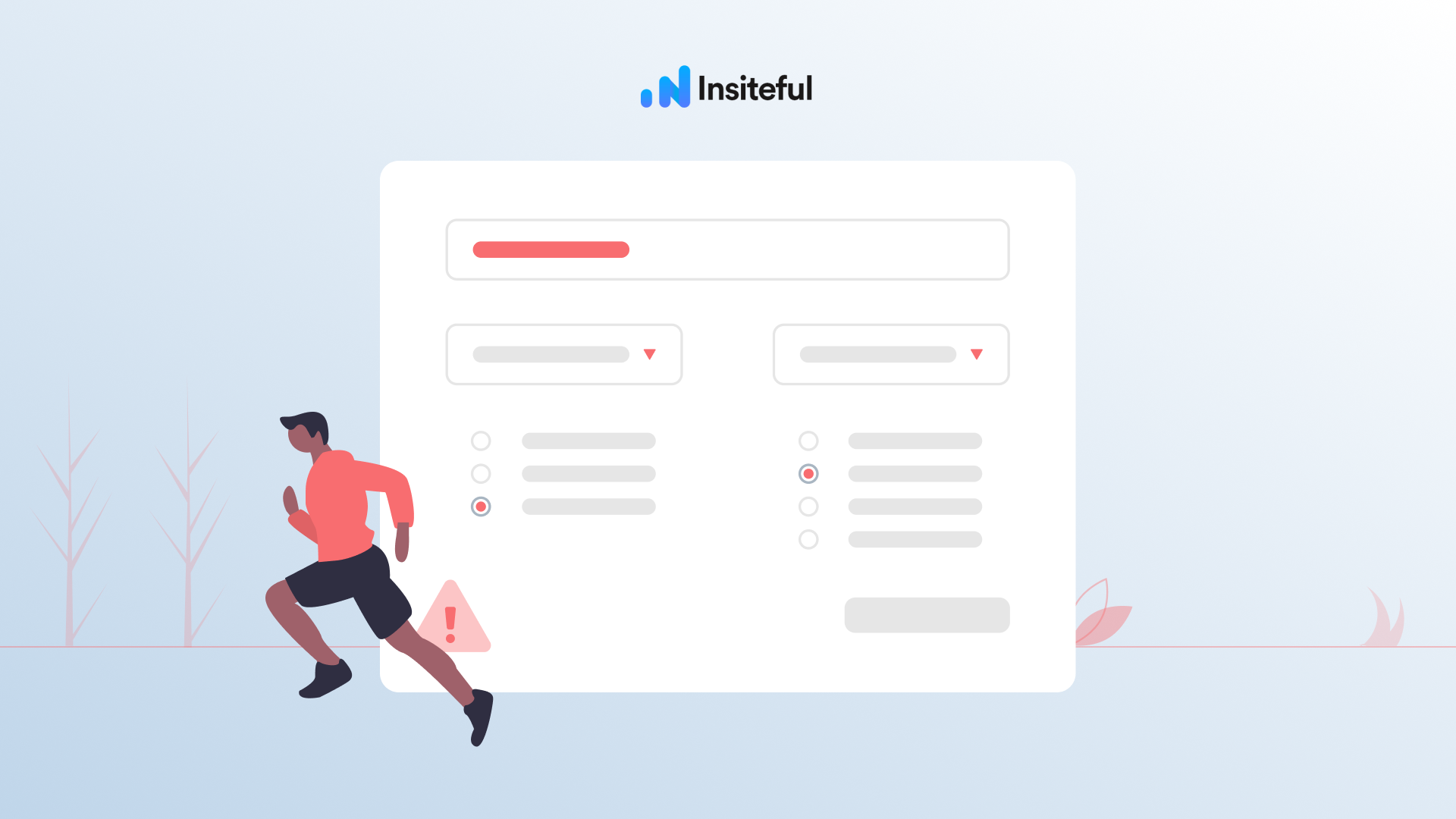
5. Asking for unnecessary details
It’s natural to want to collect as much information as possible from visitors who fill out forms, as this can aid sales or inform future marketing strategies. This can, however, easily backfire, resulting in a poor user experience. The most common reasons for abandonment, according to studies, are form length, security, upselling, and needless questions.
There must be a balance between the benefit of the additional questions posed to users and the danger of fewer people completing forms as a result.
6. Not tracking your form
The final feature you might be overlooking actually doesn’t directly change your UX, and has more to do with what not to do—
The reality is, any optimization or best practice that worked for another business may or may not benefit you: in fact, it can harm your website and have the opposite effect.
Consider a user seeking legal advice: would they employ a lawyer that simply requires their name and email address? Obviously not. They want to work with someone they can trust; someone who asks the proper questions, and a longer contact form will comfort this customer that they’re working with the right legal advisor.
There are plenty of conversion goals like this: account registrations, insurance forms, loan applications, price comparisons, property searches, and all kinds of other online actions. The right conversion optimizations differ from business to business, based on unique customer expectations. There is no “silver bullet” for the perfect form design.
The question is how do you figure out which user experience tweaks are working for you?
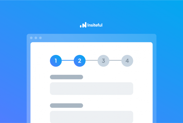
The answer is you have to go deeper behind the traffic and conversion numbers. You have to understand how your visitors are interacting with your forms; what are the choke points, and so on. Fortunately, you don’t have to spend hours watching session replay to figure this out; all you need is a conversion optimization tool such as Insiteful:
Insiteful not only tracks partial entries & abandoned forms, but also provides you smart insights on the bottlenecks & friction points in your forms, along with visual form funnel analytics.
In addition to form tracking, Insiteful is packed with features such as partial entry tracking, auto email follow-up & saved progress. With Insiteful, you’ll never miss another opportunity thanks to our all-in-one form abandonment software. Capture and convert 100% of prospects that fill out your forms with our intuitive form tracking and automated optimization tools. Insiteful has everything you need to capture & convert more leads from your existing efforts. Try it today — it takes just a few clicks!