Every business wants to capture more leads and sell their services and products to as many people as possible. To hit their marketing & revenue goals, businesses spent a lot of time, effort, and money crafting a market strategy. The journey of lead generation can be time-consuming, no doubt: from selecting the right tactics, continually deploying lead generation activities, and piercing the noise to capture the attention of busy decision-makers, then tracking what’s not working and making the corresponding changes — the list goes on.
After all the hard work has been done and a lead is ready to convert, your visitors still have to fill a form on your business’ website. Due to the fact that people don’t like filling forms, it is paramount for digital marketers to understand how to track & optimize forms in order to make them as frictionless as possible for the visitors. On average, as much as 80% of your visitors will leave your web forms before they finish filling it out.
In this piece, we will discuss everything related to forms:
- What form analytics are
- How you can use form analytics data
- Common problems affecting forms
- How you can optimize forms
- Tools you can use to streamline CRO
The problem: form abandonment

One of the last and possibly the most painful hurdle a lead generation & conversion pipeline can face is form abandonment. Form abandonment happens when someone starts filling out a form and doesn’t complete it and abandons it. In a study of 1.5 million site visitors, only 49% of them actually added details to an online form after viewing it. (Formisimo)
Why is form abandonment so bad, you might ask? Once a visitor starts filling out a form, it indicates a strong interest in your business by the user. It is also worth noting that solving form abandonment can increase your revenue without additional traffic — yet another reason that mitigating abandoned forms is so important!
What makes your visitors quit the form, though? According to a study done by the Manifest, 29% of people cite security reasons as one of the main concerns when it comes to completing online forms. Because an online form requests sensitive information, it’s critical that users trust the provider. They won’t want to input their email address, let alone their phone number if they don’t trust the form. According to one study, 92% of internet users in the United States are concerned about their online privacy.
Form length is the second biggest factor for people abandoning forms (27%), according to the Manifest study. It makes sense too as in today’s busy world no one has time to type and fill tens of fields. This is why reducing the number of form fields from 11 to 4 generates 120% more conversions (Unbounce)
Online forms that don’t have a clear copy are likewise more likely to be abandoned. The copy should be clear in terms of expressing why the visitor is filling the form. This includes copy around the form, form fields, and call-to-action. Other reasons can include distracted users, forms not optimized for the mobile interface, and so on.
What is form analytics?
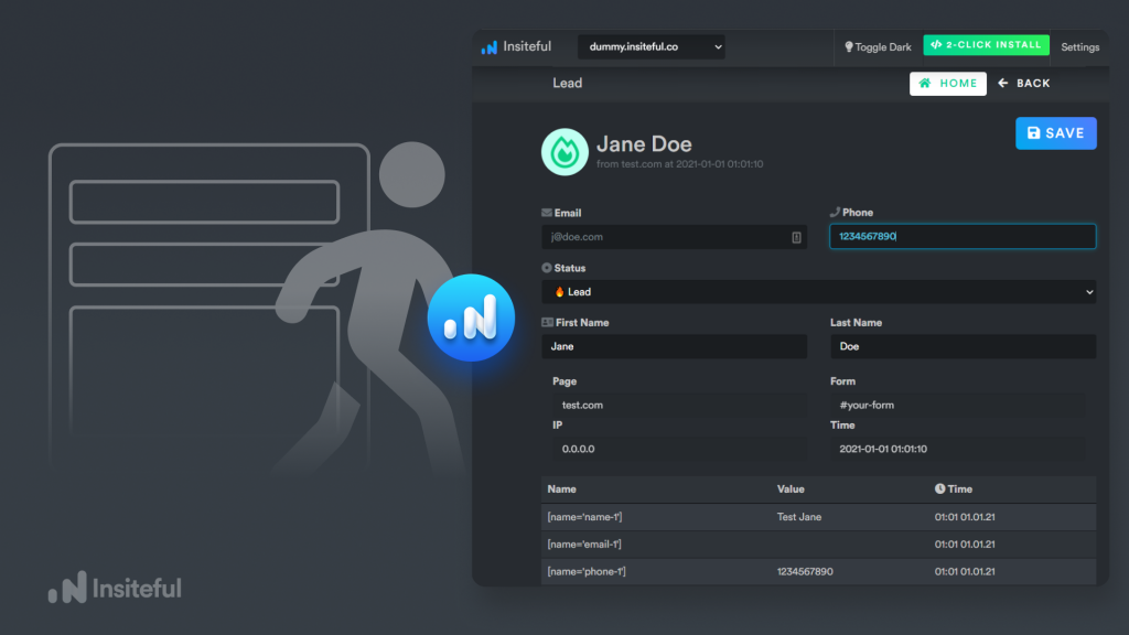
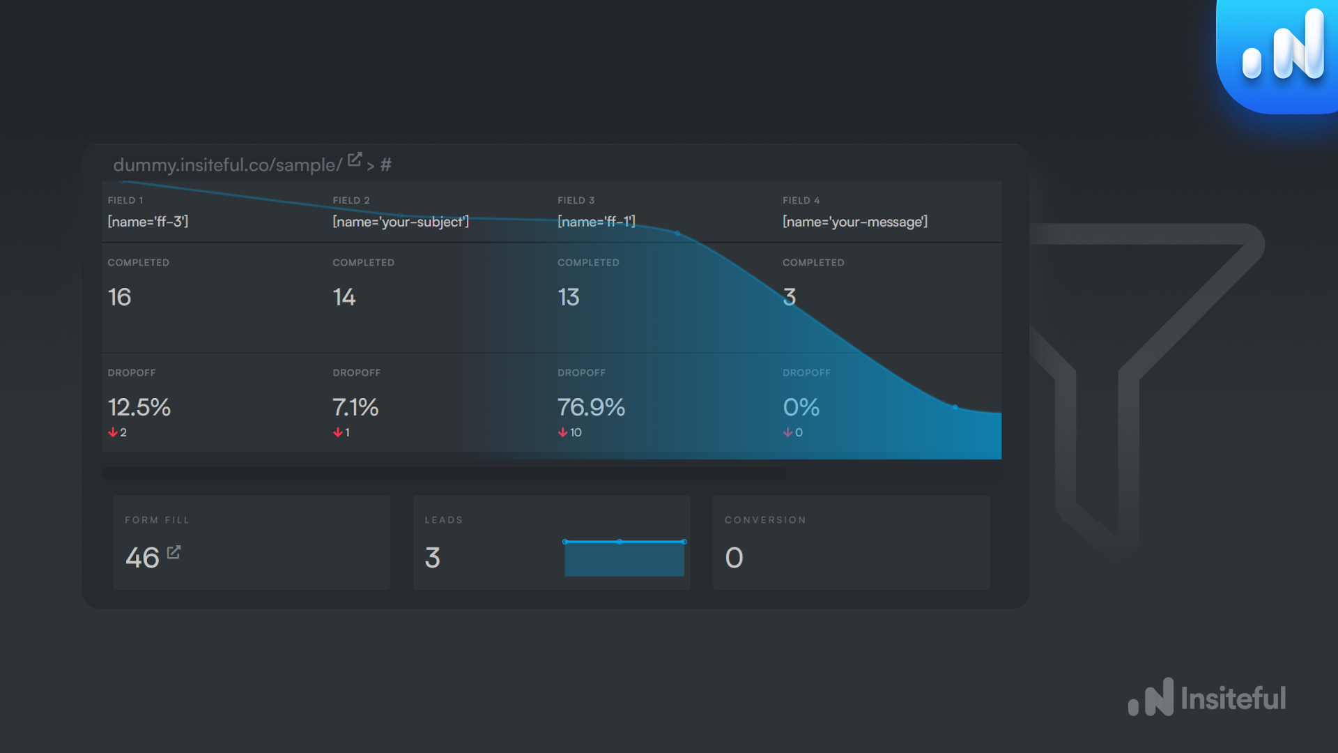
Form analytics describes a method of analyzing how visitors interact with forms on a website, including how they engage with each individual element and question within a form journey, the order in which they interact with fields, where they abandon the process, and which inputs they struggle with and return multiple times to complete it. Form Analytics provides you with measurable data that aids in the creation of a picture of the behavior patterns of your online form.
Basically, form analytics can be thought of as a way to understand what visitors are doing while they are filling out a form. Using a form tracking solution will help you answer critical questions for conversion optimization, such as:
- How long does it take to fill out a form?
- Which fields take the longest?
- What are the most problematic fields?
- What percentage of users abandon the site before submitting?
What can form analytics do for you?
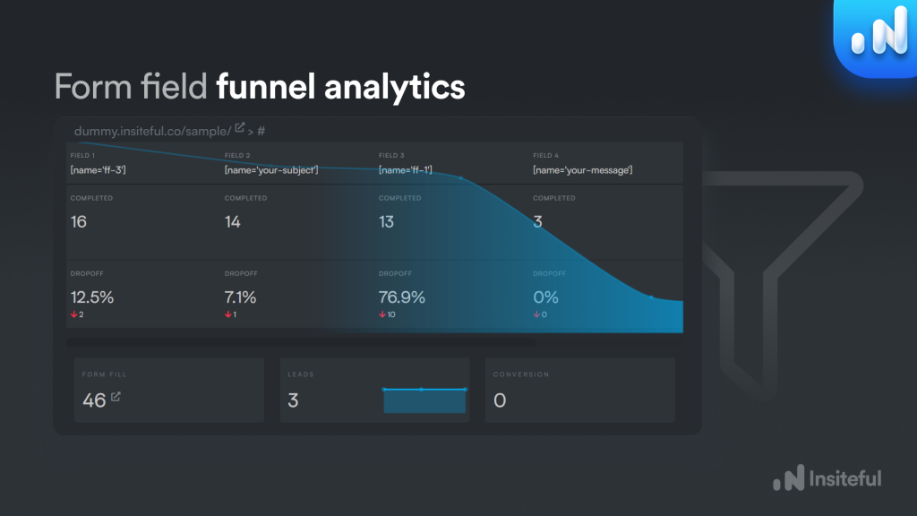
Depending on your business model, forms are usually either the final stage or an important penultimate step in your sales funnel. Most people completing a form are either buying something, requesting a quote, or contacting your company for the first time.
You get more out of your forms when you use what you learn from the analytics to cut down on abandonment. This results in more sales, more quotes, more email subscribers, or more warm leads for your business. You’ll need data, answers, and insight to tackle form abandonment. Form analytics’ ultimate purpose is to supply you with the above-mentioned metrics in order to minimize form abandonment. Form analytics will help you track how many people see your form vs how many actually fill it out, as well as where they get stuck. You can figure out exactly how to modify your forms to gain more leads and conversions.
What are the specific actions you need to take? The key is in choosing the right analytics to track your online forms. Streamlining your forms will help reduce consumer frustration and friction in the buying process, which will result in higher ROI from your marketing.
How to optimize your forms
![]()
The aim of form optimization is to gain insight into how your customers interact with your forms, and then implement changes to increase the completion rate. Form analytics is an ongoing process: your visitors’ behavior might also change over time, so there are always opportunities for improvement. Here are some steps you can take to optimize your web forms and remove barriers to completion:
Make your form easy to understand
As soon as your visitor hit any complication, they will abandon the form. As such, try to make your form so easy that any regular person could understand it. This will include simplifying the copy around the form as well as the call-to-action (CTA). Only use one CTA as pages with only 1 CTA have 1.6% more conversion power than those with 2 or more (Unbounce). Try to avoid generic CTA such as submit and download. Personalized CTAs outperform non-personalized CTAs by 42% (HubSpot).
The layout of the form also matters. It’s advisable to use a single-column layout to better control the user journey and avoid confusion. One more thing you can do to avoid confusion is to use labels within the form fields to set expectations such as DDMMYYYY.
Reduce friction in your forms
After the form is easy to understand, it’s time to reduce any friction. You can start this step by using smart form field logic. Smart forms are dynamic in the most basic sense. Smart forms can vary based on how a person answers a question using conditional logic, rather than static words on a screen. Do you want to ask different questions to different types of users? Smart forms get the job done. However, smart forms won’t do any good if the questions themselves are difficult to understand, so make sure that your copy is clear.
Understanding and resolving friction issues is the best method to make your forms convert more leads.
Streamline form submission
You must optimize the technical parameters of your forms and website to streamline form submission. For example, if your website takes too long to load, visitors will abandon it before the form appears on the screen. Conversions are reduced by 7% when pages take too long to load (Neil Patel). Similarly, you may utilize the auto-populate feature to make filling out forms easier, or inline validation to highlight mistakes in real-time.
Remove hurdles to form completion
Using a CAPTCHA or spam blocker sounds like a great idea to prevent spam or DDoS attacks, however, they pose a significant challenge and obstacle for the visitors and can cause them to abandon farms. Another way you can reduce friction is by not asking your visitors to complete the form in one sitting. The world is a distracting place and people have other things to do — you can use features such as save & continue later to allow people to complete forms later.
While you are trying to remove barriers, don’t forget the mobile traffic. Most people are using phones, tablets, and other devices to access your website. Optimize your forms for different aspect ratios and screens. At the end of the day, A/B testing your forms and understanding analytics is your best bet to find & remove hurdles.
Form analytics with Insiteful
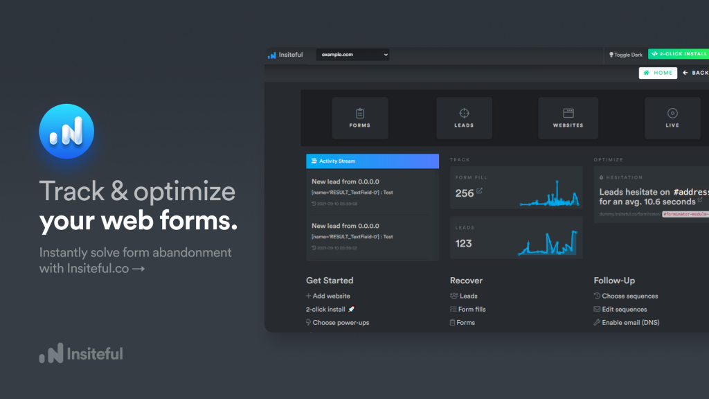
Through optimizing one form at a time, Insiteful has been on a quest to make the web more effective for marketers and more frictionless for website visitors.
Insiteful assists businesses in better understanding user behavior in online forms so that they can improve their form performance. We know that using form analytics data can make a major difference in your site’s conversion rate based on our years of form optimization and consulting experience.
For all sizes of businesses, Insiteful is a turnkey solution for form abandonment: set up end-to-end automation with the most comprehensive conversion optimization platform. Unfinished form replies and partial leads can be captured with our industry-leading solution. Utilize your existing forms and marketing efforts to their full potential.
With “one-click” features like greeting returning guests and letting them save and restart their progress, our technology has all the tools to analyze and optimize every form field on your website: assisting you in identifying bottlenecks, improving form UX, and increasing conversion rates with techniques that regularly outperform your competitors.
Insiteful’s conversion rate optimization (CRO) platform can help any business gain more leads and sales from their website and forms with an easy-to-use interface and the industry’s most advanced form tracking engine, compatible with virtually any builder or platform.
Insiteful has everything you need to capture and convert more leads from your existing efforts, from smart insights and form funnel analytics to partial entry tracking, auto email follow-up, and stored progress. It only takes a few clicks to get started!
