Est. Reading Time: 9 min • Updated: Mar 2022
Is your website getting traffic, but no leads? clicks, but no conversions? You are not alone: the average rate of form abandonment is estimated to be nearly 76+%.
Form abandonment is less documented than its infamous cousin, cart abandonment, but the concept is much the same:
What is form abandonment?
Simply put, when someone starts filling out an online form, but doesn’t finish.
First of all, what is form abandonment? It’s when someone starts filling out your form, but doesn’t submit it. Forms are a crucial part of the sales funnel. They’re how you collect contact info, qualify leads, and turn interested people into buying customers.
For many service companies, forms are the primary means of generating leads and customers. For example, “Request Demo” forms for software companies or “Work With Us” forms for service providers are often the most important source of leads for these respective businesses. Missing a potential lead to form abandonment translates to lost revenue, which is why form abandonment is a critical component of conversion rate optimization.
Why form abandonment matters
If a visitor fills out a form on your website, they must be genuinely interested in your products or services. No matter the reason for abandonment, you are losing a potential customer.
Studies shows that (on average) as much as 76% of form submissions on your site are getting abandoned. That means you’re losing out on nearly 2 in 3 of potential leads! To put that in perspective:
If you have 100 website visitors and 10 of them start filling out your lead form, but only 3 actually submit it, you’re missing nearly 75% of leads — 7 people — who were interested in engaging you.
Form abandonment is most likely the leading driver of lost revenue online for your company — esp. considering studies suggest that the majority of form submissions are abandoned. This is what makes form abandonment so important: it directly translates to dollars left on the table for your business.
Abandoned forms can be a big challenge for marketers. You’re doing all this work to drive traffic to your site, but then visitors leave before they even convert on your offer. Here are just a few of the reasons why people abandon forms:
What causes form abandonment?
Form abandonment can result from a wide variety of factors: from poor web design to everyday distractions. A few common causes of abandoned forms include:
- Too many (or too few) form fields
- Unclear copy or confusing fields
- Asking for too much personal information (ie. phone number, address)
- Distractions (ie. pop-ups, upsells, display ads)
Simply place yourself in the shoes of one of your visitors to understand what is causing them to abandon your forms. For instance, imagine you started a registration form which requires an OTP that takes anywhere from 2 to 5 minutes to arrive — most users are sure to drop-off before completion.
Before we dive into how to solve form abandonment, here’s an infographic summary we created for those who’d prefer a visual overview:
Share this infographic:
<a href="https://insiteful.co/form-abandonment/?ref=embed" target="_blank"><img style="width: 100%;height: auto; margin: 0 auto; text-align: center" src="https://insiteful.co/wp-content/uploads/form-abandonment-infographic_insiteful.jpg" alt="" width="1500" height="4591" srcset="https://insiteful.co/wp-content/uploads/form-abandonment-infographic_insiteful.jpg 1500w, https://insiteful.co/wp-content/uploads/form-abandonment-infographic_insiteful-98x300.jpg 98w, https://insiteful.co/wp-content/uploads/form-abandonment-infographic_insiteful-768x2351.jpg 768w, https://insiteful.co/wp-content/uploads/form-abandonment-infographic_insiteful-335x1024.jpg 335w" sizes="(max-width: 1500px) 100vw, 1500px"></a>
From the perspective of an organization, form abandonment is a missed opportunity — the potential for a visitor to become a customer is lost. It’s a marketing and sales team’s nightmare — someone expresses interest in your product or service, but for some reason, they didn’t have the patience or time to finish filling out your lead capture form.
However, from the perspective of the visitor, it’s not all bad. When faced with long and confusing forms or barriers to completing them, people are prone to abandon them — and (in some cases) that’s exactly what you want them to do. If your forms are meant to capture motivated customers, you don’t want the unqualified leads filling them out anyway.
However, there are times when visitors leave forms they actually intend to complete: this happens when someone who’s already invested time in filling out your form gets distracted or confused before they can submit it. This can happen because they’re called away by an unexpected phone call or email alert, their computer freezes up, they forget their username or password (if they have one) or any other number of reasons.
How to reduce form abandonment
As a business owner or digital marketer, you want to minimize form abandonment to prevent missing out on an ideal lead or customer. The key to getting more conversions out of your web forms is to optimize your form experience. Below are some surefire approaches to prevent/combat form abandonment:
1. Optimize Form Length (shorter isn’t always better)
Conventional wisdom is that shorter forms (i.e. less form fields) translate to higher conversion rates — it’s a logical hypothesis: less for the user to do = less friction to convert. Yet, form length is a tricky subject and there have been multiple conflicting studies done on Form Length and Conversion rate. Is a short form the absolute truth or silver bullet? No! Reducing form fields can actually bring your conversion rate down if you eliminate fields that people want to interact with, as discovered by research from Unbounce conversion optimization expert, Michael Aagaard.
From a user’s perspective, some fields are essential. For example, if a student is applying to a school, they might expect to choose the subjects and campus location among other things. An admission form consisting of only Name and Email might feel inadequate.
From a business’ perspective, longer forms can result in fewer but higher quality leads. Having said that, the data shows that shorter forms often do better than longer forms and there isn’t a simple rule you can follow when it comes to the Form Length. However, one thing that you should follow is to have optimal UX.
2. Improved UX (user experience)
If you can’t afford to trim down a few form fields, an (often equally-effective) alternative is to streamline your form user experience (UX). In this scenario, perhaps a GIF would serve best to illustrate what we mean by this—
In the brief 8 years since their inception, the team at Typeform has undeniably established themselves as thought leaders when it comes to engaging form UX:

The hallmark of the TypeForm methodology, however, is quite easily replicable (with or without their software). Simply put, they make forms less intimidating by only showing the relevant fields & text, while hiding and/or overlaying the rest. This approach is proven to increase completion rates on longer forms.
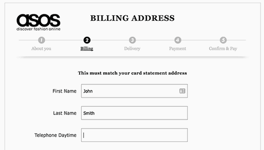
Creating such “multi-page” or “step-by-step” forms is usually easily accomplished within the default functionality with most all form builders & software (e.g. WordPress users can easily design multi-page forms like the example above with plugins like Elementor, Fluent Forms, and Gravity Forms).
This is a deceivingly simple approach guaranteed to increase conversions: break up your forms into easily-digestible sections — usu. with some progress indicator (either numbered questions, or a percentage bar).
3. Emphasize key notices
Always be sure to prominently highlight key offers & features that remove barriers-to-entry, such as…
- No credit card required,
- No risk / obligation
- 100% money-back guarantee
- No contract / month-to-month
Simply reiterating such perks — even if they’ve been mentioned before, will help encourage users to progress through your form. Furthermore, incorporating interactive form data to personalize the experience (e.g. questions that address users by first name) has been shown to help further increase conversion.
4. Remove unclear copy
Be precise with labels and call-to-actions (CTAs)! Too often, forms have the generic “Submit” or “Send” button at the conclusion.
When coming up with your CTA copy, try to address these two key questions (formulated by Michael Aagard):
- What is my prospect’s motivation for clicking this button?
- What is my prospect going to get when they click this button?
To help your brainstorming, we’ve classified some examples in a table; although all of the below are an improvement from something generic, we’d recommend aiming for the “Inspired” category:
| TIRED CTA’s | WIRED CTA’s | INSPIRED CTA’s |
| Request demo | Get A Quote / Pricing | Try It Free |
| Get started | See It In Action | Shop {Brand} |
| Buy / Download now | Confirm Subscription | Click to {Action} |
| Apply Now | Join Now | Plan / Start Your {Product} |
| Contact Us | Get Free / The {Lead Magnet} (e.g. Proposal, eBook) |
For {Customer Group 1} | For {Customer Group 2} (e.g. Advertisers, Publishers) |
5. Optimize load times
The Internet age has become synonymous with impatience — according to a recent study by Microsoft, the average attention span today is 8 sec: less than that of a goldfish. As people grapple with a barrage of information daily (est. over 35G per day), long lead forms and slow web pages are being left in the dust.
Surveys showed 52% of people buying goods & services online stated that pages loading quickly is important to their site loyalty. The first step to a fast, seamless online customer experience is auditing your website to ensure industry best practices (e.g. minified resources, image compression) for page speed & load time are in place.
6. Avoid personal details
Depending on the purpose of the form(s), asking for certain personal details can put-off users & make them quit before completing. For instance, including an Address or Birthday field would be entirely expected (and therefore, have little impact on drop-offs) on the application form for a private lender, but would certainly cause some drop-offs in the bookings contact form for a boxing studio.
7. Experiment to find what’s best for your users
At the end of the day, these are all just suggestions based on what has worked for other companies. As you can imagine from the prior example, it will be down to A/B testing to identify exactly what works best for your business & offering in terms of length, style, and fields.
8. Incentivize completion
Encouraging users to complete forms with an upfront value-add is one proven method to help users overcome their fear of commitment and complete signing up for your service.
This is a great opportunity to add value, and demonstrate the depth of your service / offering. Some example incentives that may work for your business:
- Free Consultation or Quote
- Lead Magnet (e.g. eBook, Research)
- x% OFF or complimentary add-on (first month FREE)
Get a FREE 1:1 demo! 🌱
One of our product experts would be more than happy to give you a live presentation of how Insiteful can help you add to your bottom line.
Track your forms
Tracking in Google Analytics
Form tracking in Google Analytics isn’t impossible, but it can be really, really confusing if you aren’t trained in analytics tracking and Google Analytics. Unless you’ve added a specialized code for form abandonment tracking, GAnalytics leave you entirely blind to missed leads and incomplete form submissions.
Nevertheless, Google Analytics can be “hacked” to track forms using some custom code, if you’re an experienced developer: One method of Form tracking is through Form triggers and built-in Form variables in Google Tag Manager; you can enable them and create a Form Submission trigger, hence turning on Google Tag Manager Form auto-event listener. The issue, however, is that form auto-event listener listens for a standard submit browser event and the developer could be using any technology (e.g. jQuery’s $.ajax) for sending Form data. This will cause Google Tag Manager to not register any form submission. This method also fails when it comes to tracking form abandonment.
If you want to use Google Analytics to track when the user left the form, you can use the “beforeUnload” event and the transport field in Universal Analytics. beforeUnload event captures the interaction data when the user leaves or closes the web page. With this information you can use an Advanced Segment to only view interaction data for sessions where the form was not submitted. However, this only works when best practices are followed and without going into too much complex details, let’s just say things can go wrong and this method might not work for you unless you know your JavaScript.
Form Abandonment Software
There are other methods to track From Abandonment through Google Analytics but as mentioned earlier, they are far from foolproof and require that you have substantial knowledge and understanding of JavaScript and GA.
Instead, you may prefer specialized form abandonment software intended specifically for form tracking & analytics (no coding knowledge required), such as Insiteful.
Click to learn more about partial form entry tracking and other ways Insiteful can help reduce form abandonment, or read on below:
Recover lost leads; reduce form abandonment:
Partial form tracking: capture 100% of leads that fill out your forms
The simplest & quickest way to combat form abandonment is to use a tool to capture partial entries on your lead forms.
First and foremost, get prospects email first — before any other form fields.
It’s common for visitors to bounce once you ask for their payment info, even if they won’t be charged — or any other information they regard as sensitive. Get their email addresses before this happens so you have a chance to follow-up.
As mentioned earlier, form tracking in Google Analytics (and other such generic analytics tools) isn’t impossible, but it can be really, really confusing & is by no means foolproof.
For those looking for a more straightforward & reliable solution, you may be interested in Insiteful, which is a platform built speicifcally for capturing partial form data. In just two clicks, you can start collecting the information that people enter into form fields (even if they don’t hit submit).
Provided contact information from partial form data, you’re in total control of how to recover abandoned form leads: whether omni-channel ad remarketing, or simply following up directly via email (manually, or automatically).
In addition to tracking partial entry data, Insiteful also provides funnel analytics and smart insights on form field bottlenecks (ie. confusing fields or hesitation points) so you can effortlessly identify the friction points where users are abandoning your forms. With our solution, you can immediately optimize your forms and eliminated problem areas without having to spend hours reviewing session replay and analytics data.
Read more about partial lead capture and other ways Insiteful can help combat form abandonment here.
Follow-up via email
As suggested above, the natural next step is to encourage partial leads to convert. While some companies choose more complex means (e.g. exit-intent popups, retargeting ads), old fashioned email follow-up is a surefire and straightforward path to closing another deal.
eCommerce companies are able to recover nearly 1 in 3 sales via abandoned cart email; you can do the same with lead forms! As mentioned before, forms should always first ask for email, then other key details. That way, even if these warm leads drop-off, you will be able to follow-up with a special offer, helping hand, or other value-add.
Usually, such follow-up email sequences are best timed based on how long leads usually take to convert. This approach worked for Ninja Outreach: with just 2 emails, they were able to achieve a 11.6% trial conversion rate at a healthy 30%+ open rate.
Depending on your web & marketing automation stack, you may be able to automate these email drip sequences if you’re game to put in the time to set up & configure a few integrations and have the right tools.
For those looking for a plug-n-play solution, you may be interested in Insiteful, which is a platform specifically-built for automatic follow-up.
Insiteful can fully automate email follow-up and even remarketing via Facebook or Google Ads, plus many other features to help combat form abandonment.
In conclusion
That wraps it up! Here we’ve attempted to provide a fairly detailed introduction to form abandonment, why it matters, and how to reduce it & increase sales.
Never miss another opportunity™, with Insiteful: the all-in-one form abandonment software solution. Capture and convert 100% of prospects that fill out your forms with our intuitive form tracking and automated optimization tools. Learn more about how Insiteful can help you automagically increase your conversion rate here.
And don’t forget, if you like this article, then please follow us on Twitter, Facebook, IndieHackers, or subscribe below.
